.png)

Missing the 10 Best Days: What That Chart Measures
On the S&P 500 from 2006 to 2025, our data gives 10.91% a year fully invested against 6.51% missing the ten best days. On the same window, missing the ten worst days returned 15.83%, and missing both sets 11.23%.
Quantlake Time in the Market Study · 127 daily series · data through 31 August 2026 · updated 24 September 2026 · refreshed monthly
Two things to take away. Missing the ten best days looks costly, and the mirror image is larger: on the S&P 500 from 2006 to 2025, missing the ten best days took the annual return from 10.91% to 6.51%, and missing the ten worst took it to 15.83%. Neither set of days could be known in advance.
The useful fact is where those days fell. In the median series, 50% of the ten best days came within five trading days of one of the ten worst: the largest rebounds arrived in the same weeks as the largest falls.
You have seen this chart. An adviser shows it, or a fund brochure does: a tall bar for staying invested, a short one for missing the market's ten best days, and the conclusion that trying to time the market destroys returns. This paper reproduces it on our own data, then adds the two lines the published version leaves out.
What the chart is. The exhibit takes an index, removes the handful of days that turned out to be its largest rises, and compares what is left with staying invested the whole way. The days are chosen after the fact from the finished record. That choice makes the gap wide.
What this paper shows
- The arithmetic is right, and the magnitude is the point. On the S&P 500 from 2006 to 2026, ten days out of about 5,206 trading sessions is 0.19% of the period. Missing them took 4.3 points a year off the return.
- The same exercise on the worst days moves the result further in the other direction. On the chart's own window, missing the ten worst days added 4.9 points a year; missing the ten best took off 4.4. Neither set can be picked in advance, so the pair measures how much of the return sits in the tails.
- The best and the worst days share the same weeks. In the median series, 50% of the ten best days fell within five trading days of one of the ten worst, against 0% when the dates are drawn at random. A decision that avoids one set tends to miss the other.
Does the chart reproduce?
Yes. The exhibit is re-cut every year, so two windows are worth stating. On the one it uses now, the S&P 500 Total Return index from 2 January 2006 to 31 December 2025 with cash earning nothing, our data gives 10.91% a year fully invested and 6.51% missing the ten best days. On the 2004 to 2023 cut, where the published figures are 9.8% and 5.6% (Motley Fool Wealth, credited to J.P. Morgan; the current edition is the Guide to Retirement), our data gives 9.72% and 5.51%. Nothing below disputes the arithmetic.
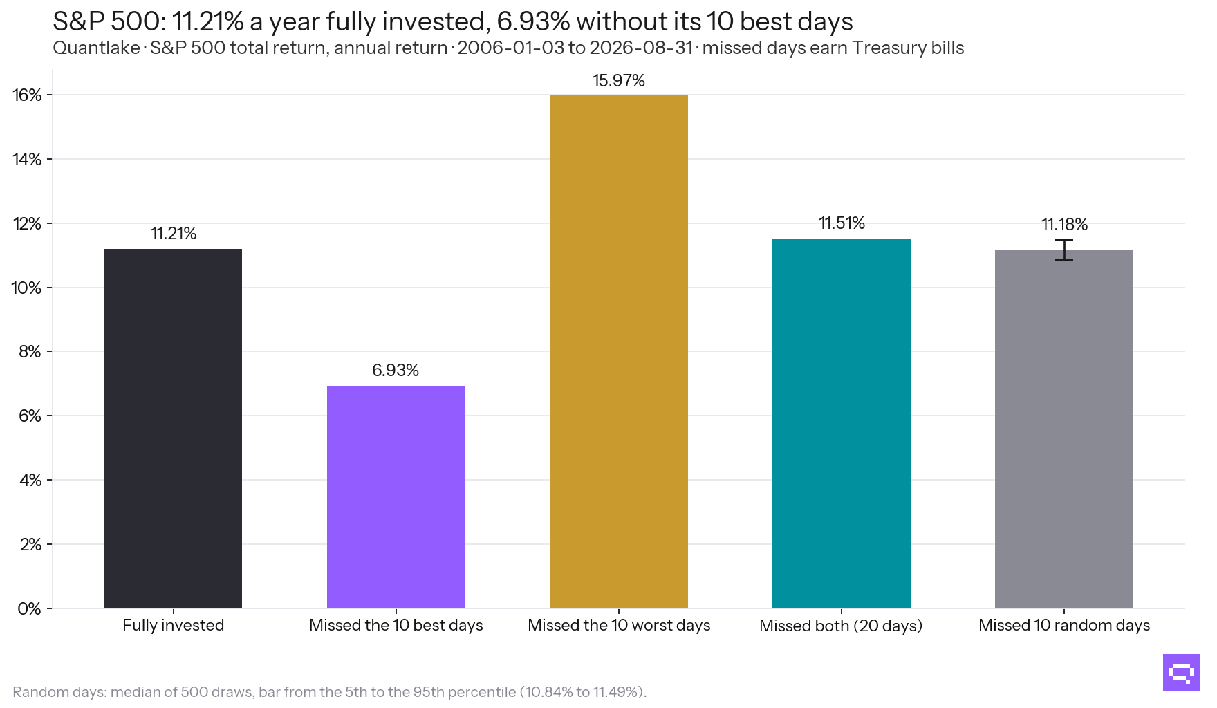
The published exercise, with the two lines it leaves out and a random-days baseline.
What happens if you miss the worst days instead?
On that window, 2 January 2006 to 31 December 2025, with cash earning nothing, missing the ten worst days took the S&P 500 from 10.91% a year to 15.83%, a gap of 4.9 points against 4.4 for the ten best. Missing both sets returned 11.23%.
The study's common window, 2006 to 2026 with cash earning Treasury bills, gives the same order: 4.8 points for the ten worst days and 4.3 for the ten best. Missing both sets left 11.51%, above the 11.21% of staying put. Across the 83 ETFs, funds and indices with the full window, missing both left the investor at or above fully invested in 56 of them.
Neither line is a plan. Both are counted from the finished record. On both windows the downside tail weighed at least as much as the upside tail.
Missing days at random changes almost nothing. Ten random days cost the S&P 500 0.03% a year, the median of 500 draws. All of the gap in the published chart comes from knowing which days to miss.
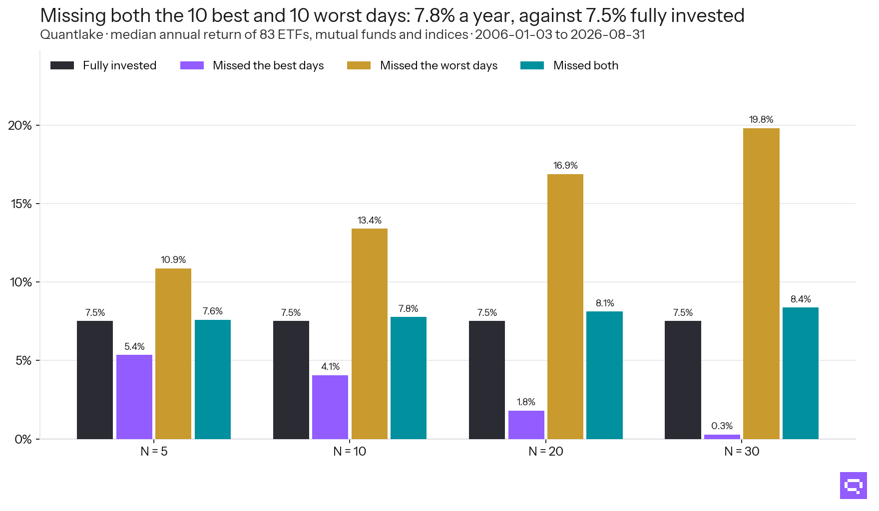
The median across 83 ETFs, mutual funds and indices, at four counts of missed days.
What is the chart actually measuring?
Volatility. The cost of missing the ten best days tracks the asset's own volatility at a correlation of 0.97. It is 0.3% a year for the calmest series here and 7.1% for the most volatile. The gain from dodging the ten worst days tracks volatility at the same 0.97.
The chart is steeper for assets that move more. On a short-dated bond fund it barely tilts. On emerging-market equity it is close to vertical. The size of the gap is set by the asset's volatility.
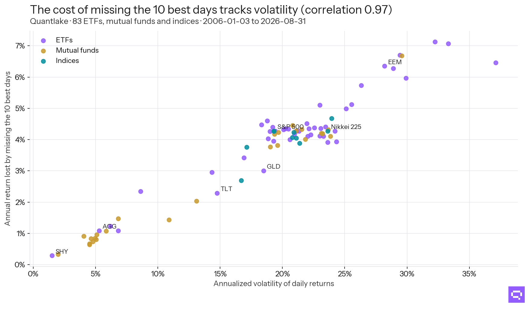
Each point is one fund or index over 2006 to 2026.
Why do the best and worst days arrive together?
Both sit in the most volatile stretches of their own series. Measured through the day before, so that no day places itself, the best and the worst days sit at the 98th and 97th percentile of their own series' trailing volatility. In the calmest tenth of days, 0.01% are among an ETF's best 1%; in the most volatile tenth, 6.9%. For the worst 1%, the two figures are 0.10% and 6.0%.
How close together. In the median series, 50% of the ten best days fell within five trading days of one of the ten worst. Dates drawn at random put that at 0%. For 82 of 83 series, the observed share beats 95% of the draws that keep each set's own clustering and break only the alignment between them.
The industry reports the same pattern on the S&P 500. The page that publishes the ten-best-days exhibit states that seven of the ten best days fell within two weeks of the ten worst (Motley Fool Wealth). Hartford Funds, citing Ned Davis Research, reports that 76% of the best days from 1996 to 2025 fell in a bear market or the first two months of a bull market (Hartford Funds).
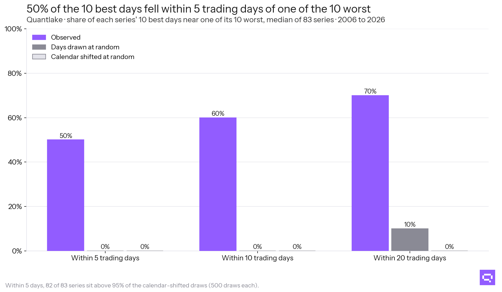
Against two ways of placing the same days by chance.
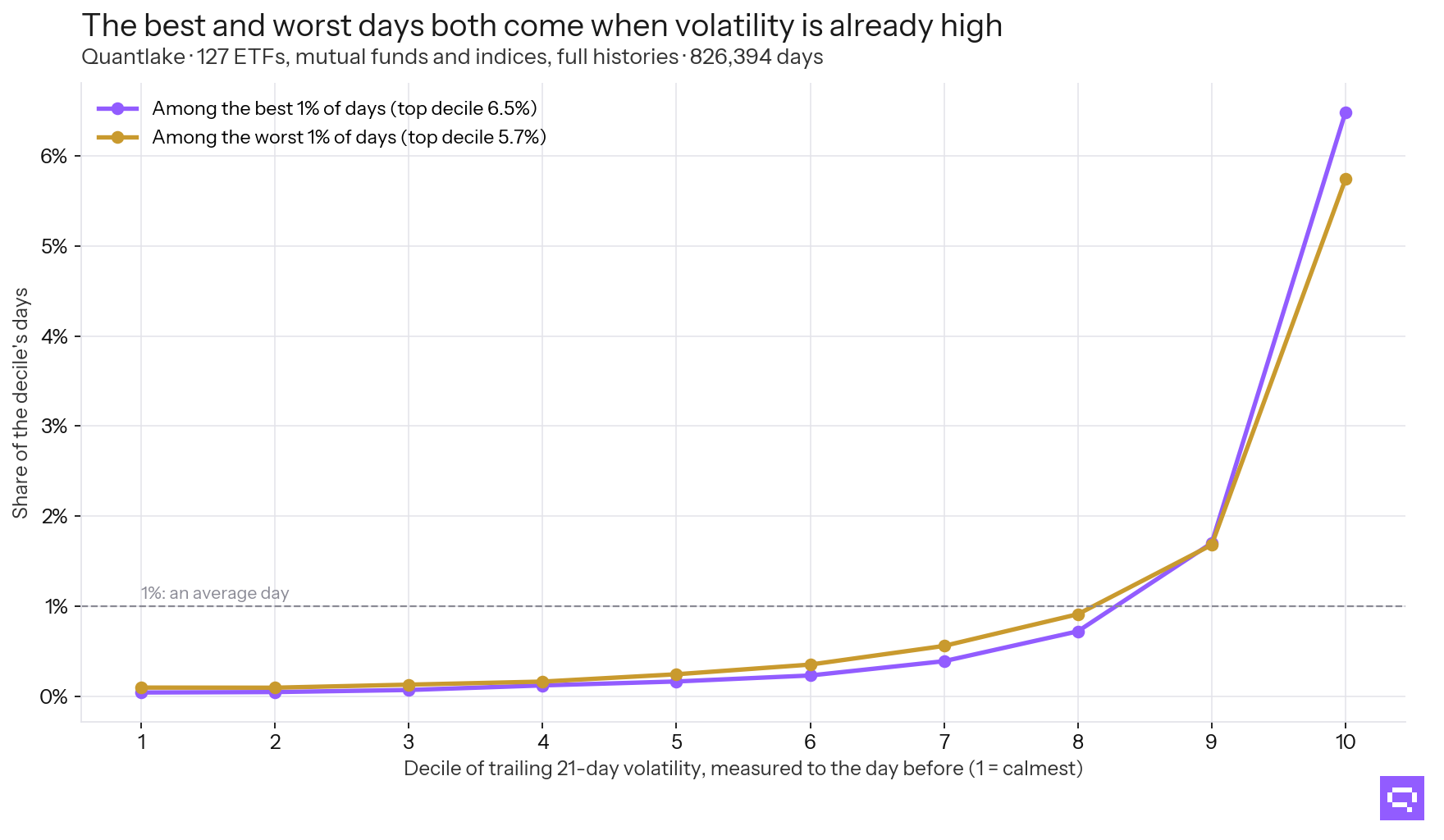
Pooled across 123 ETFs, mutual funds and indices, over their full histories.
The best and worst days fell in the same weeks, so a decision that steps out to avoid the falls also steps out of the rebounds. What Selling in a Crash and Waiting to Buy Back Cost measures it: waiting for the old high after a crash day sat out 90% of the ten best days and 80% of the ten worst.
Does it matter when the missed day falls?
For a lump sum, barely. Missing a day divides the final value by one plus that day's return, whenever it falls: 2008-10-13 cost 10.4% and 2025-04-09 cost 8.7%, in the order of their size. Their dates play no part.
For someone still paying money in every month, it matters a great deal. The later day cost 8.5% of the final pot and the 2008 day 2.3%, because far more money was invested by the later date.
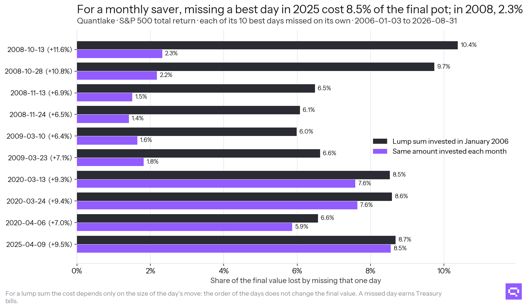
Each of the S&P 500's ten best days removed on its own.
Does the chart look the same on a market that went nowhere?
No. Sorted by their own return over the window, the weakest third of our series lost 2.3% a year to missing the ten best days and the strongest third 4.0%. Missing both sets left the investor at or above fully invested in 13 of 28 of the weakest and 21 of 28 of the strongest.
The chart grows with the market it is drawn on. Missing the Best Days in Japan, Europe and Since 1929 carries that further, on eight markets outside the US and on the S&P 500 back to 1929.
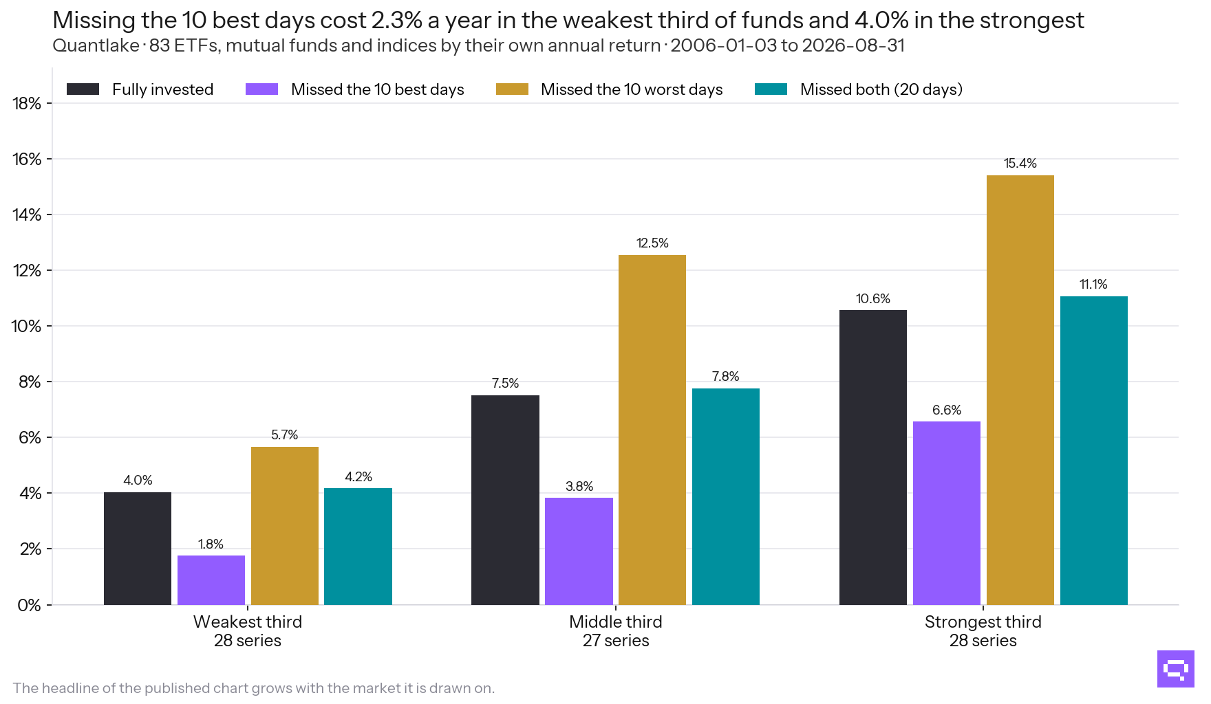
83 series, sorted into thirds by their own annual return.
Where in a decade do those days fall?
Together, and unevenly. Over the ten years to 2026-08-31, 58% of all the best and worst days of 124 series fell in year 4 of the window, the year to August 2020.
For a lump sum, the cost of a missed day hardly depends on when it fell: 4.6% in year three against 4.8% in year ten. For someone still adding money each month it climbs from 1.5% to 4.7%, because the pot is largest at the end.
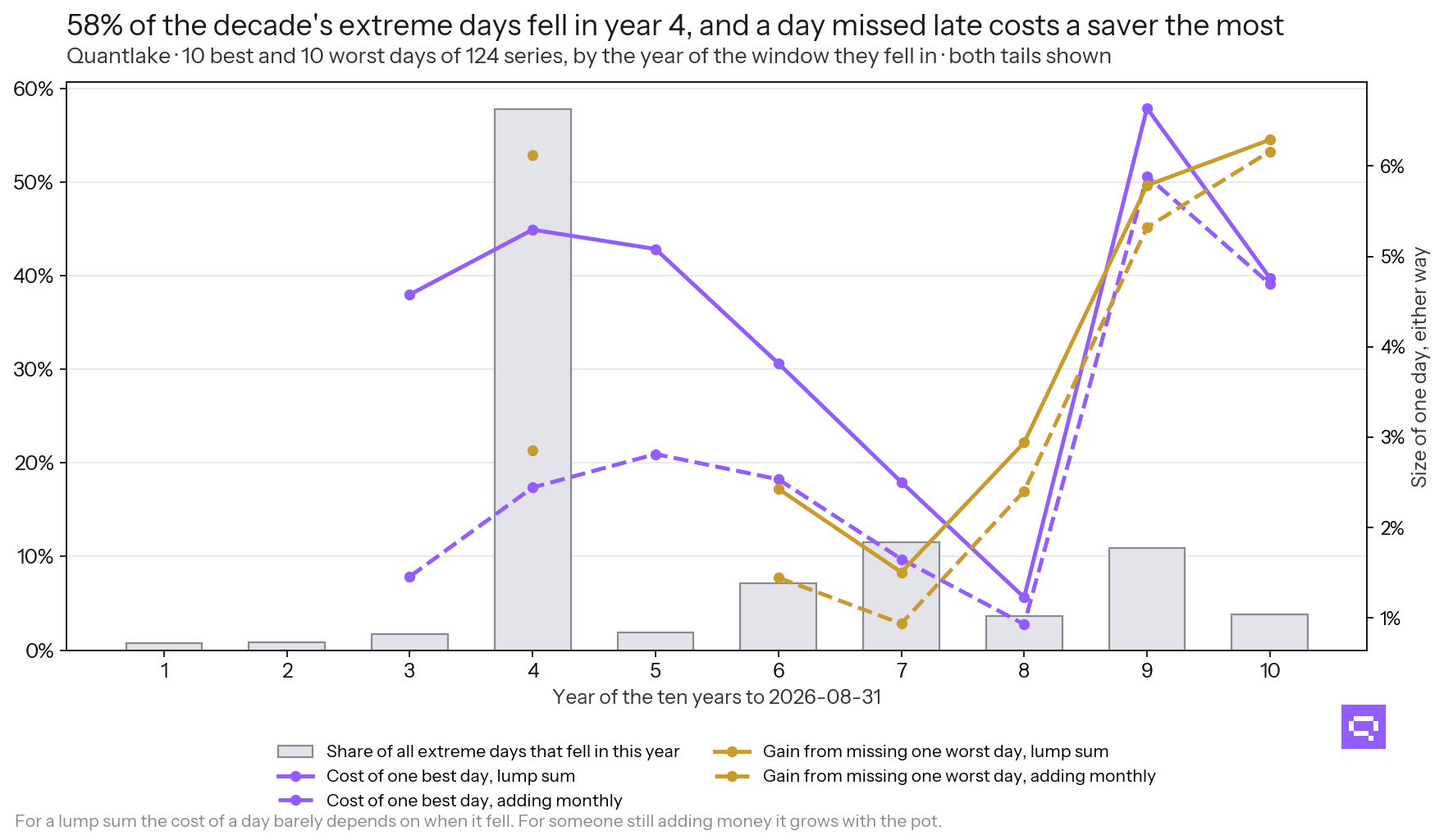
The 10 best and 10 worst days of each series, by the year of the window they fell in.
What it means
The chart measures how concentrated returns are, and that concentration is real. The arithmetic is right.
The chart cannot establish the decision it is used to recommend, because the portfolio it compares against was never available. Holding the market is a choice an investor can make on day one. Holding the market minus the days that will turn out to be its best can only be computed afterwards. The chart is consistent with staying invested. It cannot compare staying invested with an alternative, because its alternative was never open to anyone.
Two papers take decisions that were open and put numbers on them: Can a Timing Rule Avoid the Worst Days?, which runs three rules an investor could have followed from day one, and What Selling in a Crash and Waiting to Buy Back Cost, which is the version of this chart that an investor can actually walk into.
Frequently asked questions
Related
- What Selling in a Crash and Waiting to Buy Back Cost
- Missing the Best Days in Japan, Europe and Since 1929
- Can a Timing Rule Avoid the Worst Days? Three Tested
- What Followed the Market's Worst Days, and Its Best
- Does dollar-cost averaging work? A study on ETFs and funds
- Quantlake Time in the Market Study: Method and Data