.png)

Missing the Best Days in Japan, Europe and Since 1929
The published exhibit is drawn on one index over one window that ends in a long rise. On the S&P 500 back to 1929 the four lines read 10.24% fully invested and 5.85% without its 49 best days. On a market that did not rise, the whole picture moves down with it.
Quantlake Time in the Market Study · 127 daily series · data through 31 August 2026 · updated 24 September 2026 · refreshed monthly
Two things to take away. The best-days effect is not peculiar to the recent US market. It appears in every market and window tested, including the S&P 500 back to 1929.
The level of the picture comes from the market underneath it. In the Nikkei's worst 20-year window, holding lost 6.95% a year; missing its ten best days, it lost 10.81%; missing its ten worst, 2.96%. The chart measures extreme days inside whatever market actually occurred.
A chart is only as general as the sample it is drawn on. This paper runs the same four lines on the S&P 500 back to 1929, after inflation, on eight markets outside the United States, and on every window ending 31 August 2026, so that the gap can be separated from the market it was measured in.
What the chart is. The exhibit takes an index, removes the handful of days that turned out to be its largest rises, and compares what is left with staying invested the whole way. The days are chosen after the fact from the finished record. That choice makes the gap wide.
What this paper shows
- The gap appears in every market and every decade tested. Removing the best days lowers the outcome by arithmetic, so the sign does not change.
- The level of all four lines moves. In the 2000s, staying invested returned −1.0% a year. In the 1990s, it returned 18.0%.
- On a market that did not rise, the level fell and the two gaps stayed about equal. In the median 20-year window of the Nikkei 225 since 1967, fully invested returned 3.23% a year; missing the ten best days took off 3.8 points, and missing the ten worst added 4.0.
How does it read on the S&P 500 since 1929?
With dividends reinvested, 10.24% a year fully invested and 5.85% missing its 49 best days. That count is one for every two years of the record. After inflation, the same two lines read 6.96% and 2.70%.
Does the gap change by decade?
The gap does not change sign. The baseline does, and the baseline is what the picture conveys. In the 2000s, staying invested returned −1.0% a year, missing the best days −4.9%, and missing both sets −0.8%, above staying invested. In the 1990s, staying invested returned 18.0%.
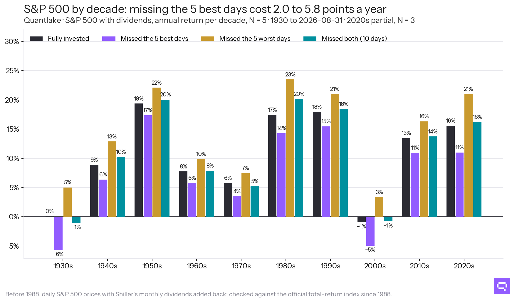
Dividends reinvested; the 2020s are partial.
What does it look like on a market that went nowhere?
Over every 20-year window of the Nikkei 225 since 1967, the median window returned 3.23% a year fully invested, −0.54% missing its ten best days, and 7.26% missing its ten worst.
The worst window began 1989-03. Fully invested, it lost 6.95% a year; missing its ten best days, it lost 10.81%; missing its ten worst, it lost 2.96%. Neither alternative was available to an investor at the start.
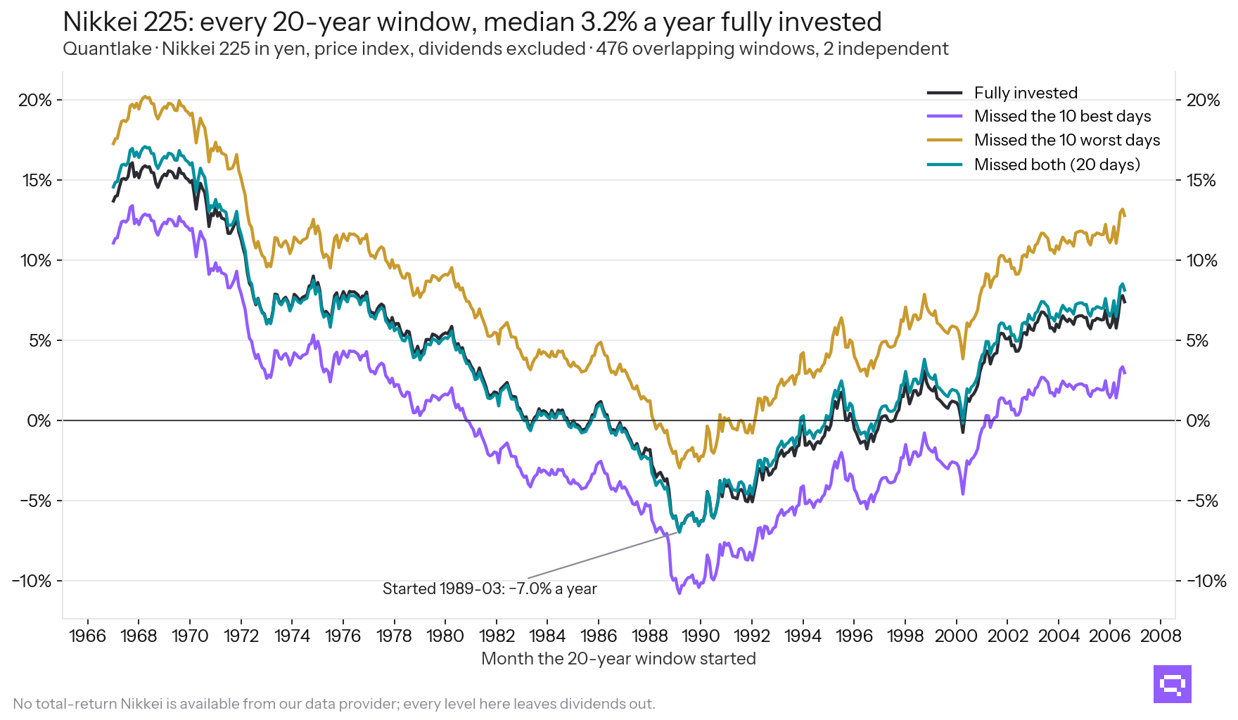
Local currency, dividends excluded: no total-return Nikkei is available from our provider.
What about the window ending 31 August 2026?
Across the 124 series with ten years of history, the median returned 9.7% a year, and 3.6% missing the ten best days. Over the past twenty years, the same two figures are 7.8% and 4.0%.
Missing both sets beat staying invested in 103 of 124 series over ten years and in 57 of 85 over twenty. Ten days is a larger share of a short window than of a long one. The J.P. Morgan exhibit is drawn on twenty years.
| Window ending 31 August 2026 | Series | Fully invested | Missed the 10 best | Missed the 10 worst | Missed both |
|---|---|---|---|---|---|
| 5 years | 127 | 7.4% | 0.3% | 17.1% | 8.0% |
| 10 years | 124 | 9.7% | 3.6% | 17.1% | 11.0% |
| 15 years | 105 | 8.2% | 4.5% | 14.1% | 10.0% |
| 20 years | 85 | 7.8% | 4.0% | 13.5% | 8.1% |
| 25 years | 63 | 8.7% | 5.2% | 12.8% | 9.2% |
| 30 years | 35 | 6.5% | 4.4% | 10.2% | 6.7% |
Medians across the series with that much history. A series enters a window only when its data covers the whole of it, so the longer windows hold fewer, older series.
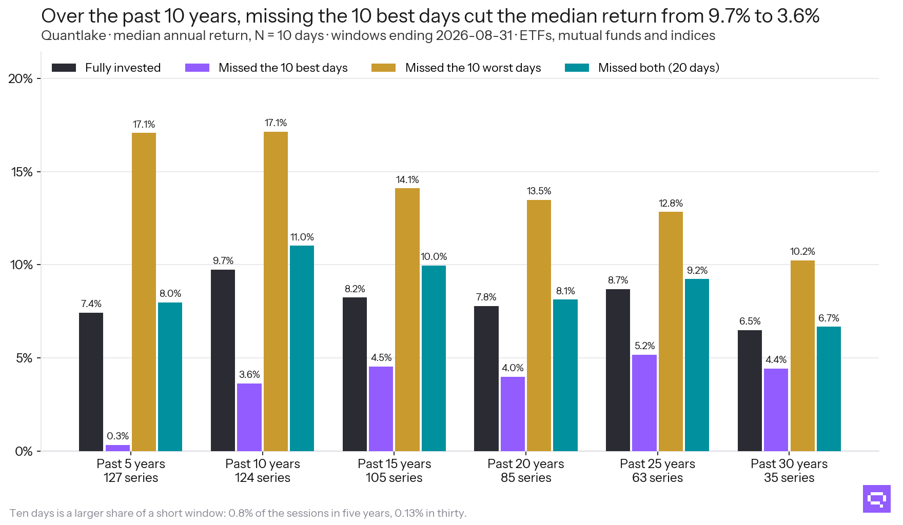
Ten days is a larger share of a short window than of a long one.
What it means
The gap in the published chart appears in every market we tested. The level of all four lines changes across markets and decades: the S&P 500 returned −1.0% a year fully invested in the 2000s and 18.0% in the 1990s. The chart's arithmetic holds in every sample. The return printed under it depends on the sample chosen.
What the chart measures on its own data, and what it cannot establish, is set out in Missing the 10 Best Days.
Frequently asked questions
Related
- Missing the 10 Best Days: What That Chart Measures
- Rolling 10-Year Returns and Ranks Across Our ETFs and Funds
- Can a Timing Rule Avoid the Worst Days? Three Tested
- What Selling in a Crash and Waiting to Buy Back Cost
- Quantlake Time in the Market Study: Method and Data