.png)

What Followed the Market's Worst Days, and Its Best
In the year after a fall in its outer 1% of moves, the median ETF returned 24.0% against 10.2% after an average day, and the median equity ETF 27.7%. Counted once per date the figure is 6.1%, against 10.6% for an ordinary date.
Quantlake Time in the Market Study · 127 daily series · data through 31 August 2026 · updated 24 September 2026 · refreshed monthly
Two things to take away. The year after an extreme fall looks large at first: the median ETF returned 24.0%, against 10.2% after an ordinary day. There is more to it than the size of one instrument's fall.
Breadth changes the picture. When at least a tenth of the universe printed an extreme fall on the same date, the ETF universe returned 14.7% over the following year, against 10.6% after a quiet date. How widely an extreme move is shared across the market is part of what the event tells us.
Missing the 10 Best Days showed the best and the worst days sharing the same weeks. This paper asks what followed them.
What counts as an extreme day. A day is extreme when its return falls in the outer 1% of the instrument's own trailing five- or ten-year distribution, measured at that day's close. Both tails are measured. In the median ETF, the five-year window contains 37 such declines and 37 such advances.
What this paper is not. Nothing here switches to cash, and no rule is proposed. The question is narrower: after a move that large, what did the next sessions hold, and what in that record bears on reacting to one.
How a trade is filled. A signal read at the close of day t is executed at the open of day t+1 for an ETF and at the close of day t+1 for a fund or an index, which is how a fund order fills. Costs are 1 basis point a switch as the base case, with 5 and 25 also reported. Taxes are not modelled.
What this paper shows
- Both tails were followed by higher returns than an average day, in the instruments that move: 24.0% in the year after a fall and 20.9% after a rise, against 10.2% after an average day.
- It is an equity and volatility effect, not a market-wide one. The median equity ETF returned 27.7% in the year after a fall against 11.6% on an average day; the median fixed-income ETF, 1.5% against 3.9%, higher on only 22% of them.
- Breadth is where the reading is cleanest. On a date when a tenth or more of the universe printed a 1% fall, the universe returned 14.7% over the next year against 10.6% after a date with no tail day anywhere; on the rise side, 15.3%. Each date counts once, so one crash is one observation.
- Counted once per date it reverses. Averaging the instruments that share a date and taking the median across dates, the year after a tail date returned 6.1%, against 10.6% for an ordinary date read the same way.
- Adding money on those days improved a dollar-cost averaging plan, the monthly plan measured in Does dollar-cost averaging work? A study on ETFs and funds, by +0.24 points a year for the median ETF and +0.26 points for the third that moved most in its first year.
What followed an extreme day, against the trailing ten years?
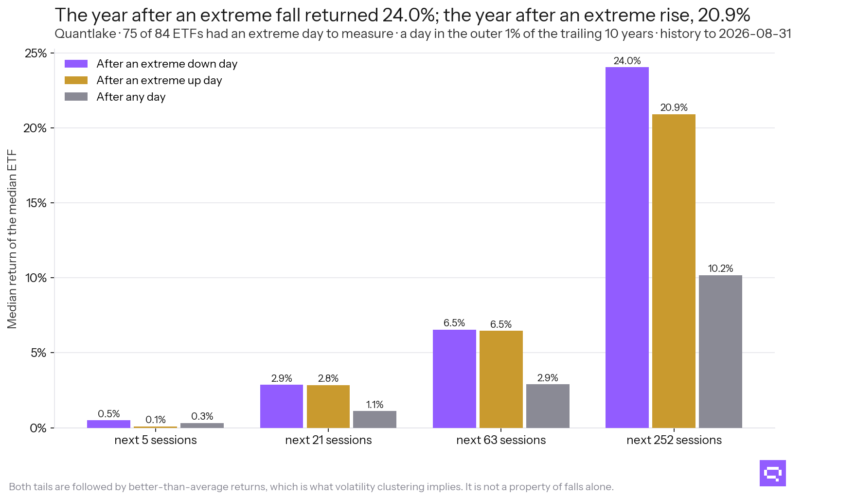
84 ETFs, days in the outer 1% of the trailing ten years.
The shape is the same on both sides. The year after an extreme day of either sign returned more than the year after an average day. The range around that result is wide enough that no single event tells an investor anything.
The first week separates the two setups. After a fall, the next five sessions returned 0.50% against 0.32% on an average day, and 62% of ETFs finished higher. After a rise, 0.08% and 43% finished higher. A rebound followed the falls. Nothing followed the rises.
How much of the market moved that day?
A tail day in one ETF is one ETF. The same day in a tenth of the universe is a market day, and the two are separate. Breadth here is the share of ETFs trading on a date that printed a day in the outer 1% of their own trailing ten years. Each date counts once, and the figures below are what the whole universe returned next, not what the instruments that printed the move returned.
Breadth reads in the same direction on both tails. It is the cleanest version of the result in this paper because it never counts one crash ninety times. When a tenth or more of the universe printed a 1% fall, the year that followed returned 14.7% against 10.6% after a date with no tail day anywhere. On the rise side, 15.3% against 10.5%.
There are 80 such broad falling dates in the record and 90 broad rising dates, so the sample covers a few dozen episodes, not a law.
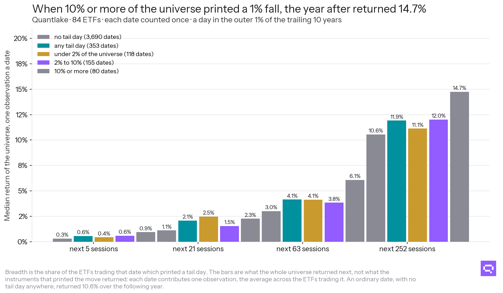
Each date counted once; the bars are the universe's return, not the movers'.
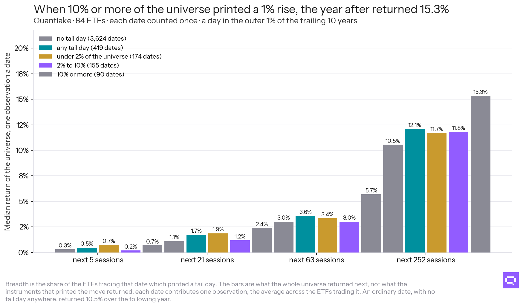
Each date counted once.
The same against the trailing five years
The five-year definition fires more often and on smaller days because a day only has to be extreme against five years rather than ten. The same two tables:
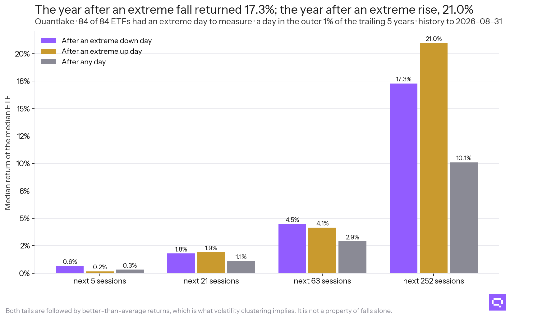
84 ETFs, days in the outer 1% of the trailing five years.
Where the effect lives
The medians above are taken across 84 ETFs that do not move alike. Sorting each day by how volatile the instrument had been going into it, and by what it holds, the effect concentrates in one corner of the universe.
On each of the 3,543 dates in the record, every instrument trading that day is sorted by its volatility over the 252 sessions ending the evening before, and the day is placed in the third that sort puts it in. The group is a property of the day, not of the instrument: the same ETF sits in the calmest third in one year and the stormiest in another, and no volatility level decides the boundary, so nothing about the placement depends on what the instrument went on to do. The same sort read as a continuous measure, the instrument's log volatility in standard deviations from the universe's average that day, gives 0.9% under −1 sd, 7.8% −1 to +0 sd, 29.8% +0 to +1 sd, 22.3% over +1 sd; the top group holds only 124 days, which is where the gradient stops rising. Each figure pools the days rather than taking the median instrument, so the levels sit below the per-instrument tables above.
The mutual funds carry twice the history of the ETFs, and they hold both equity and fixed income, so they are the check on a universe that starts in 1993 at the earliest:
The funds carry roughly twice the history and they say the same thing class by class: the equity funds returned 24.5% in the year after their own extreme fall against 12.5% on an average day, higher in 100% of them, while the fixed-income funds returned 2.6% against 5.5%, higher in 14%. Whatever this is, it is an equity effect, and it is not an artefact of the ETFs' short histories.
The gradient runs one way. A fall in an instrument sitting in the stormiest third of the universe that day was followed by 35.0% over the year, against 10.9% after an ordinary day in the same group. In the calmest third it was 2.8% against 5.2%, so a 1% day in a quiet instrument was followed by less than its own ordinary day, not more. The extreme day is worth something where the instrument was already moving.
The asset-class table states the same in the reader's own terms. Equity accounts for it. Fixed income does not. The median fixed-income ETF returned 1.5% in the year after its own extreme fall, against 3.9% on an average day.
How much of this survives a harder look?
Three readings bound it: which days account for it, who captures it, and how much belongs to the volatility that was already there.
Only the outliers carry anything. Placing every day by the size of its own move against the instrument's trailing five years, in twenty even slices, the next year's median return sits between 8.9% and 11.6% across all twenty. The gradient is flat. Only the outer 1% moves, in either direction.
The events are not independent, and the follow-up choice changes the answer. 3,749 of them across the ETFs fall on 625 distinct days, with 18% on the ten busiest and 15% in 2020-03 alone. Counting each date once rather than each instrument-day, two different questions can be asked of those dates, and they have different answers:
- Follow the instruments that printed the move. The year after a tail date returned 6.1% for them, with a 95% interval of 2.2% to 11.0%, against 10.6% for an ordinary instrument-date.
- Follow the whole universe from that date. It returned 11.9% over the year after a date with a tail fall somewhere, and 10.6% after a date with none, which is the breadth table above.
Both are date-level readings, and they give different answers. The market after a shock did better than an ordinary market. The specific instrument that took the shock did not do better than an ordinary instrument. An index holder gets the first figure. A buyer of the instrument that fell gets the second. The mutual funds read 7.19% per date on the first measure. The index series, whose histories are longest and least crowded into 2020, 14.20%.
Part of what remains belongs to the volatility. A large move happens in a volatile stretch, and a volatile stretch carries its own forward return. Separating the two needs the day placed twice, and both placements read only what was known that evening:
- How volatile the instrument already was. Its trailing 63-session volatility on the day before, ranked against its own trailing five years. A day at the 95th percentile sat in a calmer market than only 5% of its own past.
- Whether its own move was an outlier. The day's return ranked against the same trailing five years, with the outer 1% on each side counted as outliers.
The table compares outlier days with ordinary days inside the same volatility slice, at four horizons. If forward returns belong to the volatility regime rather than to the outlier, the two rows in a slice read alike.
The gap grows with the horizon and with the volatility already there. Over five sessions an outlier is worth −0.19 points in the stormiest third. Over a year, the gap is +8.63 points. In the calmest third, the year after an outlier ran −0.16 points against an equally calm ordinary day. The volatility-band table above gives the same result. The effect is absent for the instruments that do not move.
The two volatility measures differ in timing. On a 21-day reading, a calm-third outlier looks worse than its ordinary comparison because a large move enters a 21-day figure immediately, so a day that reads calm on it can be one whose volatility the day itself is raising. The 63-session reading above is slower and fairer. This paper uses that measure.
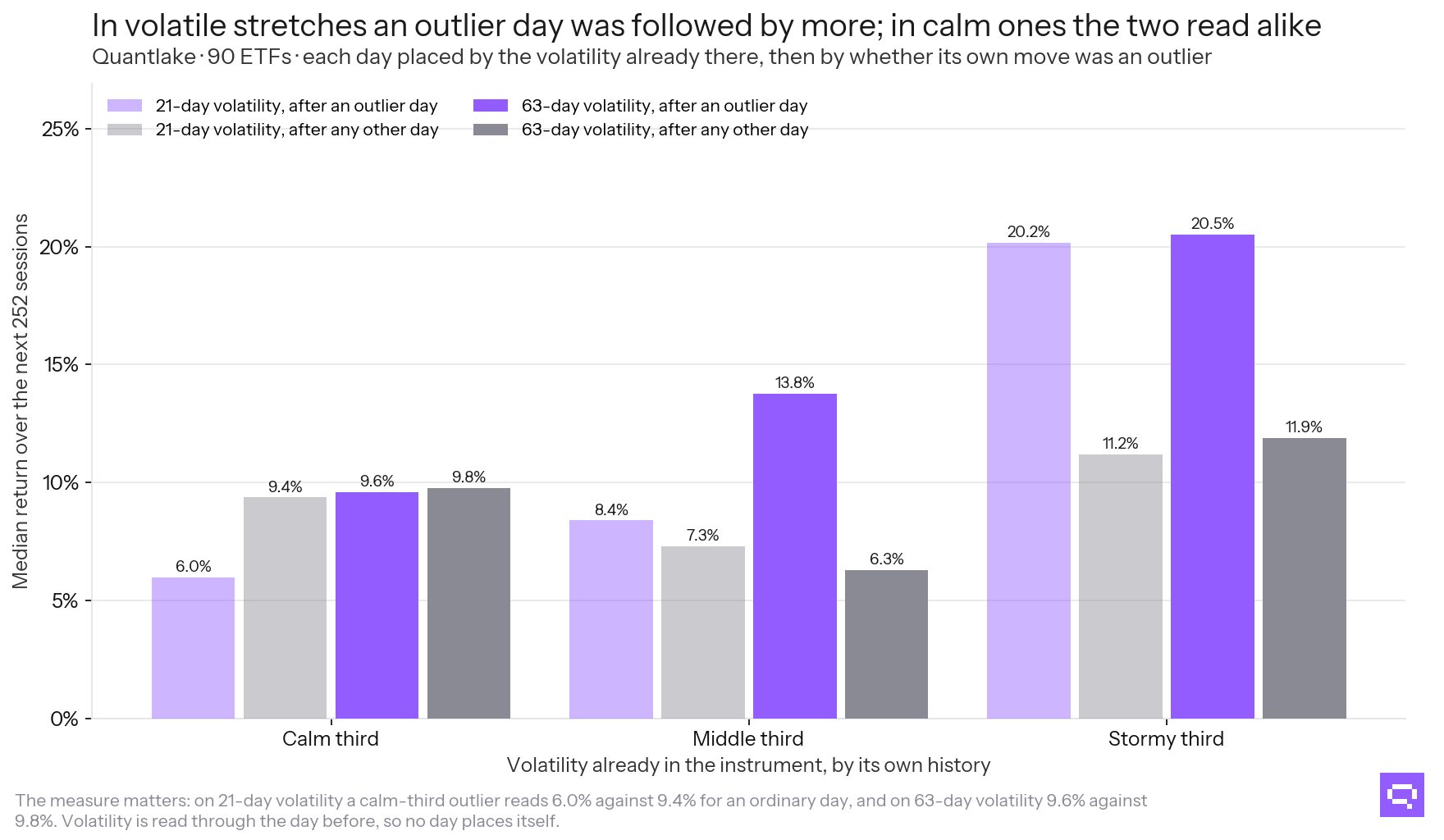
90 ETFs, next 252 sessions.
Adding money on those days
This is the one version that never leaves the market, and it improved the plan. The plan is a dollar-cost averaging plan: a fixed unit paid in every month, whatever the price. It pays that unit as usual and adds one extra on the session after an extreme day. Because extreme days cluster, the extra payments are rationed the way an investor would have to ration them: at most 12 in a calendar year, taken in date order as they arrive, with 5 sessions between two. No event is picked for its size.
Each figure is the median across instruments of that instrument's own gain over its own plain plan. It is not the difference between a median plan and a median plain plan, which would be larger: those two medians belong to different ETFs.
A plan runs for the whole window, so its group has to be fixed once. These instruments are sorted by the volatility they showed over the first year of the window, which is the sort a saver choosing between them could have made before any of the rest happened.
The gain is small and it is consistently positive: +0.24 points a year for the median ETF, better than the plain plan in 87% of them, and +0.26 points for the instruments that were stormiest in their first year against +0.06 points for the calmest. It follows the same gradient as everything else here.
Paying in after a rise did as much as paying in after a fall, +0.22 points against +0.17 points. The tables above show the same symmetry.
An investor who waits in cash for an extreme fall before investing gave up −1.1% against investing on the day the money arrived, after a median wait of 178 sessions. The event is worth a few points over the following year. The wait gives up the market's ordinary return in the meantime.
What it means
The days after an extreme move carried higher returns than an average day, in both directions, in the instruments that move. That is the clustering measured in Missing the 10 Best Days, seen from another angle: large moves arrive together, and the stretch that follows one carries the rest of them.
Three facts bound it. The effect sits in equities and high-volatility assets, and it is absent in the calm third and in fixed income. Equal-date weighting reversed the result, which is the honest event weighting when multiple instruments shared the same date. The one-year spread after a fall ran from 0.8% to 54.2%, and that range leaves a single event uninformative for a single instrument.
What remains is modest and usable. A plan that kept paying in and added a little on the days that frightened people ended +0.24 points one year ahead of the same plan without the extras, and it was never out of the market.
The mirror decision, selling after one of those days, is measured in What Selling in a Crash and Waiting to Buy Back Cost.
Frequently asked questions
Related
- What Selling in a Crash and Waiting to Buy Back Cost
- Missing the 10 Best Days: What That Chart Measures
- Can a Timing Rule Avoid the Worst Days? Three Tested
- Does dollar-cost averaging work? A study on ETFs and funds
- Quantlake Time in the Market Study: Method and Data