.png)
The CAGR Myth That Could Cost You Thousands
The CAGR Illusion: Why That Smooth Growth Chart Is Lying to You
The gap between what financial calculators promise and what you actually experience
That chart looks perfect — your $100,000 grows in a flawless arc to $761,226 over 30 years at 7% annual returns. The message? Sit back, relax, and let compounding do its magic.
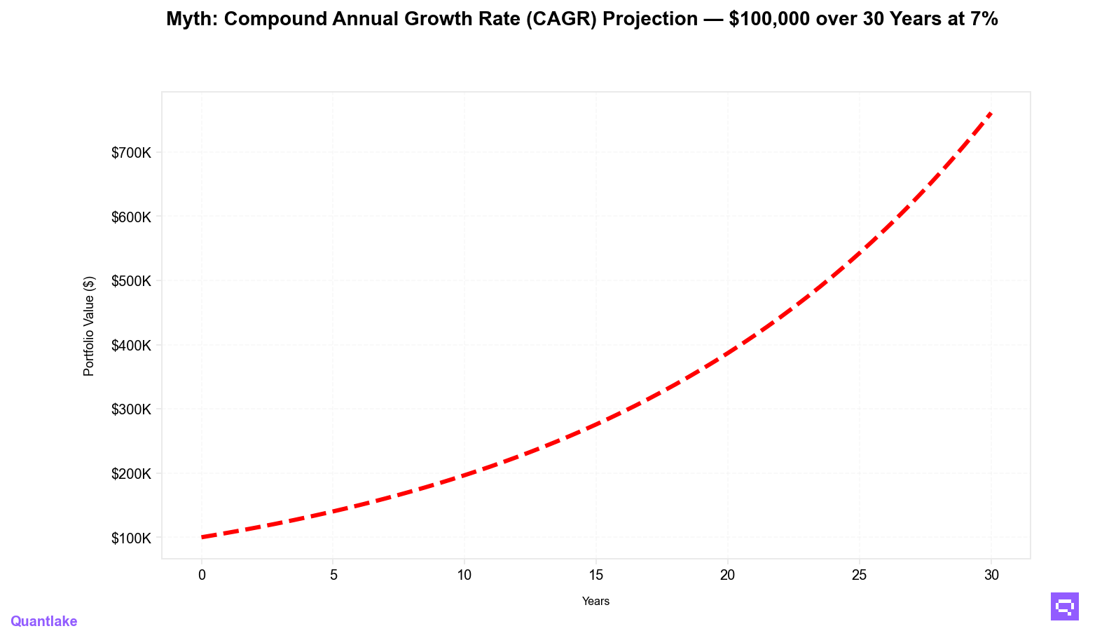
The truth? That smooth line is a fairy tale. In reality, you’ll see those returns delivered through a jagged, stomach-churning path where your portfolio might lose almost half its value — multiple times — before reaching the destination.
The classic CAGR chart shown in calculators and brochures — a single smooth growth line from $100,000 to about $761,226 in 30 years at 7% annual return — hides the volatility, drawdowns, and range of outcomes you’ll actually face in real markets.
At Quantlake, we believe investing should be simple and stress-free — but that starts with honest expectations. Our Monte Carlo simulations show why the smooth CAGR projection is one of the most misleading visuals in personal finance.
The Beautiful Lie of Linear Growth
Every calculator, robo-advisor dashboard, and finance blog uses the same seductive image: a perfect upward line based on historical Compound Annual Growth Rate (CAGR). Yes, markets have historically returned about 7% after inflation — but that’s an average, not a prediction of your personal path.
Here’s what that smooth line won’t show about a $100,000 investment over 30 years:
- Median outcome: $520,005 — 32.0% below the mean projection
- Volatility drag: returns reduced by 31.9% due to market bumps
- Median max drawdown: 44.6% — nearly halving your portfolio at some point
- Probability below the mean line: 65.6% (theory: 66.9%)
By the Numbers — What the Simulation Really Shows You
Statistical Reality
- Theoretical mean: $761,226
- Simulated mean: $776,840 (SE ≈ $25,059)
- Median: $520,005
- Gap from smooth projection (mean → median): −$241,221
Range of Outcomes
- P90 (best-case): $1,628,416
- P10 (worst-case but not catastrophic): $171,951
Risk Metrics
- Probability of loss: 2.4%
- Median max drawdown: 44.6%
- 95% Value at Risk (1-year): −29.1%

The Jensen Inequality: Why Volatility Costs You Money
Volatility doesn’t just make the ride bumpier — it lowers your actual compounded returns. This is volatility drag:
- If you lose 20.0% one year and gain 25.0% the next, your average return is +2.5%, but your compound return is 0.0%.
- Over decades, this effect quietly erodes your wealth even if your average return matches the smooth projection.
- Our simulation confirms: with identical average returns, higher volatility leaves you with less money.
Spreadsheet vs. Reality — The Psychological Trap
A 30.0% drawdown in Excel is just a number.
A 30.0% drawdown in your real portfolio is:
- Sleepless nights wondering if recovery is possible
- The urge to sell “before it gets worse”
- Stress creeping into personal and family decisions
- The temptation to abandon your long-term plan for short-term relief
For example, with a 44.6% median max drawdown, your $100,000 could drop to about $55,400 if it happened right at the start. If it happens later — after your portfolio has grown — the percentage drop might be the same, but the dollar loss would be even larger. The smooth chart never prepared you for that moment.
Why ETFs Help (But Don’t Eliminate) the Problem
This is why our ETF model portfolios — designed through rigorous quantitative research — are built with this volatility drag in mind:
- You get instant diversification across hundreds of holdings
- You keep costs low to avoid long-term erosion
- You see exactly what you own — no black-box surprises
- You benefit from systematic rebalancing to remove emotional decision-making
ETF portfolios can’t erase volatility, but they can help reduce the damage compared to single-stock bets or poorly diversified portfolios.
Investing With Eyes Wide Open
- Plan for the journey, not just the destination
Expect multiple 20–40% corrections over your investing lifetime.
- Keep liquidity
Maintain an emergency fund so you’re never forced to sell in a downturn.
- Anchor to the median, not the mean
The median outcome ($520k, ≈ 5.6%/yr) is more likely than the mean line.
- Prepare for inevitable drawdowns
45%-ish declines are normal in long-term equity investing — recovery is part of the process.
- Stay systematic
Dollar-cost averaging smooths your entry points.
Rebalancing keeps your portfolio aligned with your plan.
Our ETF models help you avoid costly timing mistakes.
All of this raises an important question: how much of this volatility can you truly handle — both financially and emotionally? The answer depends on your unique risk profile.
Matching the Data to Your Risk Profile
Not every investor will experience these market swings in the same way. Some can stomach a 40% drawdown without flinching; others will struggle with a 15% drop. That’s why we measure two things:
- Risk Tolerance (RT): how comfortable you are with market ups and downs.
- Risk Capacity (RC): your financial ability to recover from potential losses.
Combined, they form your Risk Score, placing you on our 1–7 Risk Level scale — from Very Conservative to Very Aggressive.
Here’s why that matters:
- If you score higher, you may be comfortable with larger drawdowns in pursuit of bigger gains.
- If you’re in the middle, you likely need a balance of growth and protection.
- If you score lower, you might prioritize stability and steady progress over high-risk growth.
By matching your portfolio to your willingness and capacity to take risk, you give yourself the best chance of staying invested through the very volatility our Monte Carlo simulations reveal.
Each of our model portfolios is assigned a Risk Level, making it easy to match your investments to your personal profile. Aligning your portfolio to both your willingness and capacity to take risk helps you:
- Stay invested during inevitable downturns
- Avoid panic selling in volatile markets
- Maintain a strategy that supports your goals over decades, not just years
The Quantlake Difference
We don’t show you fairy-tale charts. We show you the full range of realistic outcomes so you can:
- Understand volatility before you face it
- Build portfolios resilient to market shocks
- Stick to a plan when fear drives others to sell
Bottom Line: Compound growth is real — but it’s never smooth. Our Monte Carlo analysis shows:
- The median investor ends with ~32.0% less than the smooth projection suggests
- ~45% drawdowns are normal
- ~65.6% of investors will finish below the “average” line — and that can still be success
The winners aren’t the boldest or the luckiest — they’re the ones who invest systematically, diversify intelligently, and stay in the market when it matters most.
Happy Long-Term Investing!
Romain Gandon, CEO & Founder of Quantlake
🔗 LinkedIn
Disclaimer: Past performance is no guarantee of future results. Results are simulated, actual results may differ based on many factors such as liquidity, transaction costs, tax. Always use your best judgment and exercice caution when making financial decisions. You should read our T&C for more information.