.png)

Highest Sharpe and Sortino Ratio ETFs, by Asset Class
Which ETFs earned the most return per unit of risk, in equity, fixed income and specialty. Each ratio is printed with its standard error, because most of the ordering sits inside it.
Sharpe and Sortino measure the same thing differently
Both divide the return earned above cash by a measure of variability, so a fund that returned 12% with wild swings can be compared with one that returned 7% quietly.
Sortino = (return − risk-free rate) ÷ downside deviation
| Ratio | Definition | What it counts as risk |
|---|---|---|
| Sharpe | Excess return ÷ total volatility | Counts every deviation as risk, upside and downside alike. The default when returns are roughly symmetric. |
| Sortino | Excess return ÷ downside deviation | Counts only returns below zero. Rewards a fund whose volatility is mostly upside, so it separates from Sharpe only when returns are skewed. |
Sharpe treats a 5% gain and a 5% loss as equally risky. Sortino counts only the loss, which in principle suits an investor who does not mind upside volatility. In practice the two rank this universe almost identically, and the tables report how closely.
A Sharpe ratio comes with an error bar
A ratio computed from a year of data is not the fund's Sharpe ratio. It is one sample from a distribution, and the sample is small. Andrew Lo derived the standard error in The Statistics of Sharpe Ratios (Financial Analysts Journal, 2002):
T in years, for an annualised ratio S
A fund showing a Sharpe of 1.0 over twelve months carries a standard error of about 1.22. The two-standard-error range runs from below −1.4 to above 3.4. At five years the same reading carries about 0.55, and over twenty years about 0.27. Lengthening the window is the only fix, which is why these tables rank on five years and print the error beside it.
Two things make the true uncertainty larger still. Returns are not independent, which the derivation assumes. And ranking many funds and reporting the winner is a multiple comparison: with enough candidates, the top of any table is partly a record of which fund was luckiest. Bailey and López de Prado formalise the correction in The Deflated Sharpe Ratio (Journal of Portfolio Management, 2014). The count of funds indistinguishable from each leader is reported below for the same reason.
Our ETF universe is curated, not comprehensive
Roughly four thousand ETFs trade in the United States. These tables rank a curated subset, the same one the Quantlake alert system monitors, and the curation is what makes the ranking readable. Screener output produces three problems at once: the same exposure appears under several tickers, funds of funds compete against the funds they hold, and cash-like instruments sit at the top.
The last is the worst. A fund holding three-month Treasury bills is close to the risk-free asset itself. Its excess return over cash is near zero and so is its volatility, and the ratio of two small numbers is unstable and frequently large. It wins the table without having delivered anything.
The three groups exist so the comparison is like for like. A Sharpe ratio measures return per unit of risk, but how much risk gets paid is a property of the asset class rather than of the fund. Through a rate-tightening window every bond fund can post a negative ratio while every equity fund posts a positive one, and a merged table would then be sorting by asset class rather than by fund. That answers a question nobody asked. The allocation decision comes first; these tables address the one that follows it, which is that given a decision to hold bond exposure, some funds delivered it better than others.
So: one fund per exposure, no funds of funds, no cash proxies, no volatility or inverse products. The composition is reported with the tables and refreshed with them, so the list can be audited rather than trusted. Quantlake also concentrates on passive and rules-based funds, which is what makes a five-year comparison mean anything. An index fund's record is a property of the exposure it holds; an active fund's is partly a property of a manager who may have changed mid-window.
One year measures momentum, five years measures character
The two windows are not competing estimates of the same quantity. Over five years a Sharpe ratio is a classifier: it describes the risk-adjusted character an exposure has held through more than one market state.
Over one year it is a momentum reading. It says what has been working recently on a risk-adjusted basis, which is the same quantity a systematic investor tracks when scaling positions by volatility. How well that ranking persists, and how well it forecasts, are measured below. They are very different numbers, and the gap between them is the difference between describing the present and predicting the future.
Reading the tables without trusting the order
For a systematic investor the useful output is not the first row. Three readings follow from the tables without any need to trust the ordering.
Whether an asset class is being paid at all. A group where every five-year Sharpe is negative did not beat cash over that window, whichever fund is on top. That is an allocation input, not a selection one.
Whether a leader is stable or lucky. The count of funds within one standard error of the leader is printed with every table. Where most of the group sits inside that band, the ranking carries no information and cost, liquidity and tax treatment are what still differ.
Whether the regime is turning. The charts show the same funds through time, on the same measure the table ranks them by. A group crossing zero together is changing state, and that shows months before a five-year column moves.
The league tables
96 funds across 11 issuers, of which 77 are passive and 15 rules-based. Each window is measured against the Treasury bill return over that same window rather than one rate applied to all of history; cash has paid 3.7% over the trailing year. This block refreshes monthly.
Equity
The mix is broad: two dividend, two factor and two sector funds, plus one country fund and one structural themes fund, and all eight beat cash over the past twelve months. Over the past twelve months, Taiwan rose 86.1%, Value Factor gained 61.6%, and Energy added 41.8%.
XLE leads 59 equity funds on 5y Sharpe at 0.78. The standard error on that reading is 0.51, and 30 of the 59 funds sit inside it. The order of the rows is not the finding. The level is.
SPY is not in the table. It ranks 9th of 59 on 5y Sharpe at 0.53. A ratio rewards return per unit of risk, not return, so the funds most widely held sit mid-table whenever something more volatile has been paid for its volatility.
Ranking the same funds by Sortino gives a rank correlation of +1.00 and the same five funds in the top five. Sortino separates from Sharpe only where returns are skewed, and this group is not skewed enough for the choice of denominator to change the answer.
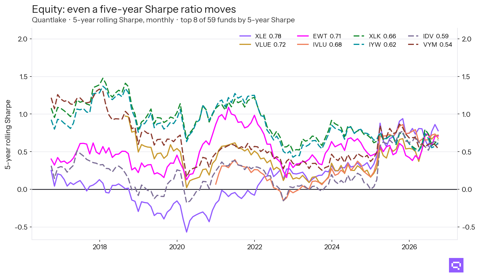
The same funds, on the same measure the table ranks them by, through time. XLE's five-year Sharpe alone travels 1.51 across the decade. A figure quoted as though it were a property of the fund is a property of the window it was measured over.
Fixed income
Credit accounts for five of the eight fixed income funds, and all eight did not beat cash over the past twelve months. In that period, Short TIPS rose 1.3%, High Yield Bonds gained 1.1%, and Corporate Credit fell 2.3%.
HYG leads 17 fixed income funds on 5y Sharpe at −0.12. The standard error on that reading is 0.45, and 6 of the 17 funds sit inside it. The order of the rows is not the finding. The level is.
AGG is not in the table. It ranks 11th of 17 on 5y Sharpe at −0.76. A ratio rewards return per unit of risk, not return, so the funds most widely held sit mid-table whenever something more volatile has been paid for its volatility.
Ranking the same funds by Sortino gives a rank correlation of +1.00 and the same five funds in the top five. Sortino separates from Sharpe only where returns are skewed, and this group is not skewed enough for the choice of denominator to change the answer.

The same funds, on the same measure the table ranks them by, through time. VCSH's five-year Sharpe alone travels 2.26 across the decade. A figure quoted as though it were a property of the fund is a property of the window it was measured over.
Specialty
Specialty is led by commodities, with three of the eight funds there, plus two alternatives, two structural themes and one hard-assets fund. Over the past twelve months, Oil rose 98.0%, Semiconductors gained 87.7%, and Managed Futures added 25.3%.
SMH leads 20 specialty funds on 5y Sharpe at 0.86. The standard error on that reading is 0.52, and 11 of the 20 funds sit inside it. The order of the rows is not the finding. The level is.
Ranking the same funds by Sortino gives a rank correlation of +1.00 and the same five funds in the top five. Sortino separates from Sharpe only where returns are skewed, and this group is not skewed enough for the choice of denominator to change the answer.

The same funds, on the same measure the table ranks them by, through time. DBA's five-year Sharpe alone travels 2.08 across the decade. A figure quoted as though it were a property of the fund is a property of the window it was measured over.
What the one-year column is worth
Six months on, the one-year Sharpe ordering still correlates 0.51 with itself. Its correlation with the returns that actually followed is 0.06. The first number is why a one-year reading is a usable momentum measure. The second is why it is not a forecast.
Ratios use close-to-close volatility over each window, against the Treasury bill return over that same window rather than a single rate applied to all of history. Standard errors follow Lo (2002) and assume independent returns, so they are a floor on the uncertainty. As of September 30, 2026.
Frequently asked questions
Related
- Sharpe ratio: the full explainer
- ETF trend metrics explained
- SPY vs RSP: cap-weight vs equal-weight
- GLD vs GDX: bullion vs miners
- MTUM vs QUAL: momentum vs quality
- Quantlake model portfolios: Classic and Smart