.png)

Top 20 ETFs for a Diversified Portfolio in 2026
Twenty funds covering the exposures most passive portfolios are built from, in three sleeves. Expense ratios, what each fund is there to do, and how every one of them performed last calendar year.
Four thousand funds is a decision problem
Around four thousand ETFs trade in the United States, and the number is the obstacle rather than the opportunity. More options do not produce better choices. They produce fewer choices.
The finding is not folklore. Sethi-Iyengar, Huberman and Jiang studied retirement plan enrolment across an analysis group of 793,794 employees in 647 plans, and found participation fell as the fund menu grew: every ten funds added was associated with a 1.5 to 2 point drop in the proportion of people who signed up at all. Where two funds were offered participation peaked at 75%; where fifty-nine were offered it bottomed near 60% (How Much Choice is Too Much?, 2004).
The cost of a long menu is not a worse portfolio. It is no portfolio. Twenty funds is therefore a deliberate act of narrowing: enough to cover the exposures a diversified portfolio needs, few enough that choosing between them is a decision a person will actually make.
What makes a fund worth holding
Three properties, and the third is the one that matters most to a systematic investor.
- Cost. Fees are charged as a percentage of assets every year, whatever the market does. The figures on this page are a fraction of what an actively managed fund charges.
- Breadth. A single purchase buys hundreds or thousands of holdings, so no individual company can decide the outcome.
- Transparency. The holdings and the rule that selects them are published, which is what makes a portfolio auditable and therefore repeatable.
That last point is the difference between a system and a series of decisions. A fund that publishes its rule can be held to it. A judgement cannot.
Three sleeves, and whether they actually diversify
The list is grouped into equity, fixed income and specialty. Equities carry the growth and the drawdowns. Bonds are ballast, held to dampen the swings rather than to outrun them. Specialty funds are focused exposures outside those two.
What the labels do not tell you is how much each one moves with the equity market, and that is the question diversification actually turns on. So the table carries a correlation column, measured against the S&P 500 over the same three years as the returns beside it.
Read it before trusting the grouping. A specialty label does not make a fund a diversifier: listed real estate carries a large share of the equity market's risk in a different wrapper, while gold has been close to independent of it. The same applies inside fixed income, where a high-yield bond fund can be more equity-correlated than anything in the specialty sleeve, because what it holds is credit risk and credit risk is equity risk in a bond's clothing.
A list that is all equity is not diversified however many tickers it contains. Nine of the funds below are equity and their correlations sit near one; the diversification comes from the other eleven, and the column shows how much each of them supplies.
The fee is the only number known in advance
Every other figure on this page is a measurement of the past. The expense ratio is a commitment about the future, deducted from the fund's own return before an investor sees it, and it compounds.
0.10% on $100,000 is $100 a year, every year, whatever the market does
Over a working life the difference between a cheap fund and an expensive one is a material share of the outcome. Our compound interest calculator shows what a given fee removes from a projection over a chosen horizon, alongside inflation and volatility drag.
The spread across this list is wide in relative terms and small in absolute ones. It matters most where funds are close substitutes: two broad US equity funds tracking near-identical indices differ mainly by fee, while a commodities fund and a bond fund are not competing on price at all.
The list is the easy part
Choosing which funds to hold is the most discussed decision and among the least consequential. Four things do more to determine what a portfolio returns, and none of them is a ticker.
- Liquidity. A wide bid-ask spread is a cost that never appears in the fee, paid on the way in and again on the way out.
- Tax treatment. It differs by domicile and by wrapper and routinely exceeds the expense ratio.
- Overlap. Two funds holding the same companies add tickers without adding diversification, and a portfolio can look varied while being one bet.
- A rebalancing rule fixed in advance. It decides what happens in the year everything falls, when the alternative is deciding during the fall.
Consistency is what turns a list into a result. The contribution that arrives every month and the rule that is followed in a bad year do more for an outcome than the difference between two large-cap funds, and both are decided before any of this matters.
How these are used in practice
A list is not a portfolio. Weights, a rebalancing rule and the discipline to follow it are what turn one into the other.
Quantlake runs two families of ETF portfolios built from exposures like these. Classic models follow long-horizon principles and rebalance on a quarterly calendar, on the free plan. Smart models are rules-based and adapt to changing market regimes, reviewing monthly and trading on threshold triggers rather than on the date, on the Pro plan. Both draw on the three sleeves above, and the model portfolios themselves set out which exposures each one uses and on what rule.
The choice between them is a choice about rebalancing frequency, and the evidence there is thinner than it is usually presented as being. Our work on portfolio drift measures what each rule actually did: the difference between quarterly and annual is small, and the difference between rebalancing and not is not.
What last year paid
The table shows each fund's total return over the last complete calendar year, and its annualised return over the three complete calendar years ending with it. Funds too young for a window show n/a rather than a shorter figure dressed as a longer one.
A single year is a single draw. The ordering within it says more about which exposures were rewarded in that particular twelve months than about which funds are better, which is what the three-year column is there to make visible.
The list
20 funds. Returns run to 31 December 2025. The average expense ratio across the list is 0.16%, from Aggregate Bonds (AGG) at the low end to Broad Commodities (PDBC) at the high.
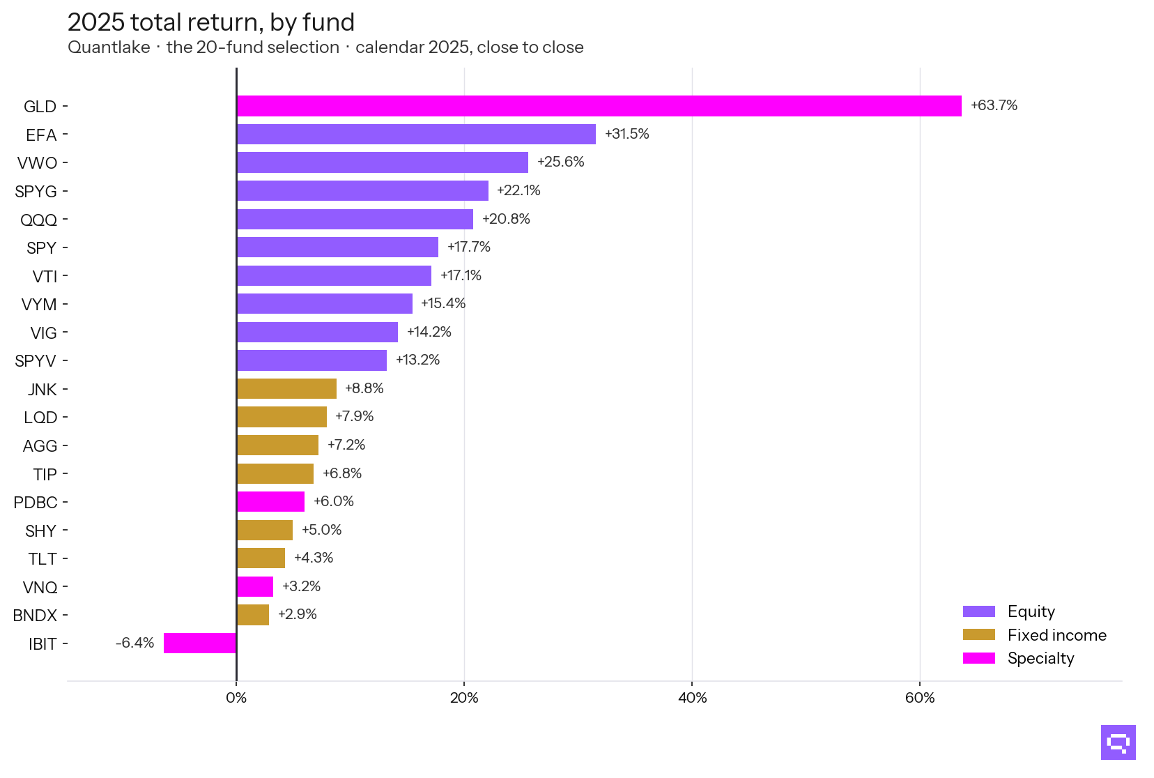
In 2025 the list ran from Gold (GLD) at +63.7% to Bitcoin Trust (IBIT) at −6.4%, a spread of 70 points inside one selection. The equity funds cluster; the widest gaps are between sleeves rather than inside them, which is the case for holding all three.
Equity
Long-term growth. This is where the return comes from and where the volatility comes from.
Fixed income
Ballast. Bonds are held to dampen the equity swings, not to outrun them.
Specialty
Focused exposures outside the broad equity and bond markets. Some diversify and some do not, which the correlation column tests.
Returns run to 31 December 2025 and are total return, close to close: 2025 is that calendar year and the three-year column covers 2023 through 2025. Expense ratios are as of September 30, 2026. Funds without a complete calendar year show n/a rather than a shorter figure dressed as a longer one. Correlation is of daily returns against SPY over 2023 to 2025. This is a starting universe, not an allocation, and nothing here is advice.
Frequently asked questions
Related
- Quantlake model portfolios: Classic and Smart
- Which ETFs earned the most per unit of risk
- Portfolio drift, and risk capacity versus risk tolerance
- How much to invest each month, and what it became
- Compare ETFs with the Sharpe ratio
- Compound interest calculator with volatility, inflation and fees